Basic Android Widgets
First, let us get down to the basics of the ways in which we can interact with a computer program.
One way is that a program gives instructions to an user and the user follows them to get the desired output. Like what usually happens in our C/C++ programs. Consider a C++ program which asks the user for two amounts(have to be given for the program to proceed), and as soon as numbers enterd the program prints sum of those two amounts. In such cases the control of flow depends on the program hence, it is called program-driven approach.
Another way in which we generally interact with the programs in our day to day life is that we see many options in the program and nothing happens until we perform any action/event. Like in an Android App or website, the result depends on the action we perform, and when we perform it like back button closes an app, clicking a button on screen might just open a new page. So basically, the output is dependent on action/event, and control of flow depends on the user hence such type of approach is called event-driven.
So can you guess whether Android apps are program driven or event driven? If your answer is event-driven then you are right. Android Apps are event-driven. Generally, most GUI applications are event-driven and perform an action after an event.
As most of us have used GUI application, let us revise types of UI elements that are common and we can perform events on them.
- Buttons
- TextView(View Text)
- EditText(Fill in Text)
List can go on, there are many more.
Each UI element you see on your Android Screen is a component of view Class that is it extends from class View, be it a Button, TextView etc. For example, a Button you see on your screen is defined in a class Button which extends from a class View in package android.widget.
There are two ways to populate UI elements on the screen.
Your application can create UI elements (and manipulate their properties) programmatically at runtime.
Defining UI elements in an XML file. The name of the tag is same as the name of the class of the particular view. The advantage to declaring your UI elements in XML is that it enables you to better separate the presentation of your application from the code that controls its behaviour.
In XML, we start each element with '<' followed by name of a class that extends a View Class. Views like Button, EditText are defined inside OS, therefore, we don't have to specifically give a path to the class, we can use 'Button', 'EditText' etc. After defining the UI element we necessarily have to define some attributes like element's height, width. And we can define some more attributes as per our need. The value for each attribute must be given in double quotes.
Special Views which can have multiple views inside them are known as ViewGroups. Example layouts which contain these UI elements. We will talk about them in a separate article.
There are some attributes which are common to each and every view defined in android. These are -
android:id
This attribute is used to declare a unique id for the particular element. The view can be referenced in code using this id like findViewById(R.id.givenId)(It returns a reference to the button). It is better to start id value with the name of the type of UI element. Example, in case of Button we can have id start with 'btn' so we can easily identify button ids in our code.
android:layout_height
This tag is used to define the height of a widget. It can have three different values 'match_parent', 'wrap_content' or custom size.
match_parent means to take the full height of the parent layout.
wrap_content means that the view wants to be just big enough to enclose its content (plus padding)
- Custom size can be in any unit like sp, dp(density-independent pixel), px(pixel). But in Android, it preferred to use dp as the size is independent of the screen pixel and can remain constant on different screens.
android:layout_width
This tag is used to define the width of a widget. It can be 'match_parent', 'wrap_content' or custom size.
match_parent means to take the full width of the parent layout.
wrap_content means that the view wants to be just big enough to enclose its content (plus padding)
- Custom size can be in any unit like sp, dp(density-independent pixel), px(pixel). But in Android, it preferred to use dp as the size is independent of the screen pixel and can remain constant on different screens.
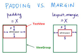
android:margin - Margin is the distance between parent element and the current element. It is given in dp. If only margin is used then all the four margins - marginTop, marginBottom, marginLeft, marginRight get the same vaue. These can be defined seperately as well.
android:padding - Padding is the distance between the border and the content of the element. It is given in dp. If only margin is used then all the four paddings - paddingTop, paddingBottom, paddingLeft, paddingRight get the same vaue. These can be defined seperately as well.

Use of the above attributes will become more clear when we go through the specific examples.
Some basic UI elements in Android, are known as Widgets and are defined in the package android.widget. These are explained below -
Textview
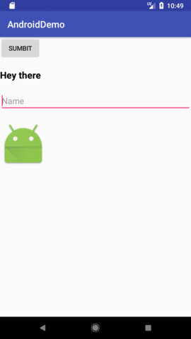
TextView is a widget in android to display plain text. TextView class directly inherits from View Class.
<TextView
        android:id="@+id/tvSomeText"
        android:layout_width="wrap_content"
        android:layout_height="wrap_content"
        android:text="Hey there"
        android:textColor="@android:color/black"
        android:textSize="12sp"
        android:textStyle="bold" />
id for this TextView is 'tvSomeText'. Its height and width is wrap_content.
android:text - This attribute defines the text inside a TextView.
android:textColor - This attribute is for the color of the text. We can provide hex values like "#ffffff" or we can reference to color defined in color.xml like "@color/black" or we can use some default colors defined in android OS like "@android:color/black"
android:textSize - It specifies the text size. It is generally defined is sp. sp stands for scalable-independent pixel. These are like dp but are affected by the font sizes defined by users in phone settings.
android:text - Android provides three text styles by default normal, italics and bold.
Button
A user interface element the user can tap or click to perform an action. Button class is child class of TextView.
To display a button in an activity, add a button to the activity's layout XML file:
<Button
    android:id="@+id/btnSubmit"
    android:layout_height="wrap_content"
    android:layout_width="wrap_content"
    android:text="Submit" />
id of the above declared button in XML is 'btnSubmit'. We can reference this button in our code using findViewById(R.id.btnSubmit)
Height and width of the button is wrap content. TextView being its parent class, all the TextView attributes work on button as well.
android:text
This attribute contains the text which needs to be displayed inside the button.
Button with width 'wrap_content'

Button with width 'match_parent'

EditText
A user interface element for entering and modifying text. It also inherits from the TextView class.
<EditText
      android:id="@+id/etName"
      android:layout_width="match_parent"
      android:layout_height="wrap_content"
      android:ems="10"
      android:hint="Name"
      android:inputType="textPersonName" />
id for the above edit text is 'etName'. Its width is "match_parent" that is it would take width of it parent layout, height is "wrap_content".
android:ems - It specifies the maximum length of text that can be entered in the box. ems means the maximum count of 'm' that can be a fitted in the edit text and 'm' is used as it is the widest character.
android:hint - It is the hint that sometimes appears on the text area to help the aid the user and is gone when we click on the edit text.
- android:inputType - It specifies the type of expected value in the text area. Like in this case, it is 'textPersonName'. In other cases, it can be a number, password etc. These are predefined types provided by android.
ImageView
Displays image resources, for example Bitmap or Drawable resources. ImageView is also commonly used to apply tints to an image and handle image scaling. ImageView directly extends View.
<ImageView
        android:layout_width="100dp"
        android:layout_height="100dp"
        android:src="@mipmap/ic_launcher"
        android:scaleType="fitXY"/>
There are two attributes that we havent seen above -
android:src - It defines the location on the image in the resource folder, mipmap is a default folder which has a picture of default launcher icon with name 'ic_launcher', so the path is written as "@mipmap/ic_launcher". We can put images in drawable folder in res, then the path would become like "@drawable/pic_name"
android:scaleType - This is attribute specifies the scaling of a image inside the imageView. "fitXY" means image should fit into size 100dpX100dp

In the due course, we will keep learning more tags and attributes.